Generic Form Element Options
In this page, you will be able to see several generic options shared among some fields.
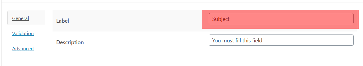
Label
Through this option, you can establish the name that will be shown next to the element. The label can be present within the element like placeholder or on the element.
The next images are a representation of the Option in the Form Builder and the Form in the Frontend.
Description
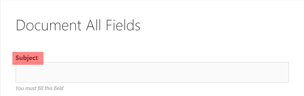
This option is for being able to establish the description of the element. It is useful to show extra information about the function of the element and It is shown below the field.
The next images are a representation of the Option in the Form Builder and the Form in the Frontend.
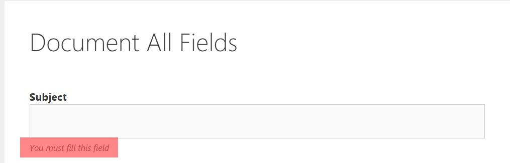
Required
The next images are a representation of the Option in the Form Builder and the Form in the Frontend.

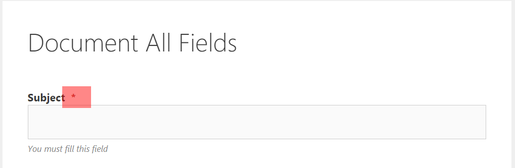
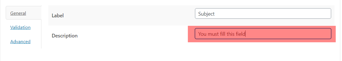
Validation Error Message
Within this: You can set the error message when a field that is required is not filled out. It is useful to know which required fields were not filled and it is shown below the field in red.
The next images are a representation of the Option in the Form Builder and the Form in the Frontend.


Add custom class to the form element
This option adds a class of CSS to the element, It is useful to apply personal styles to the element and change its appearance according to the design of your project.


Add as admin post meta box to the edit screen
Important: This option is only available from the administration of the site.
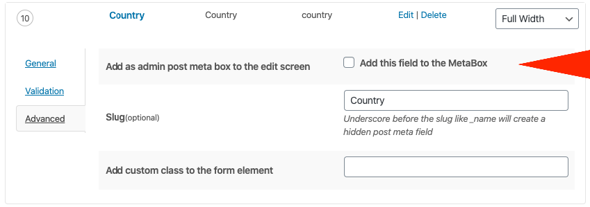
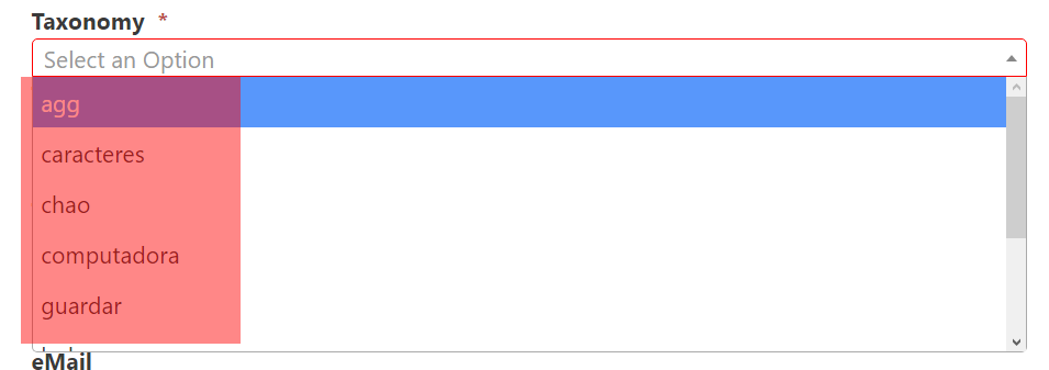
Slug
The main function of this option is that the one in charge of defines the field identifier to its utilization in the database. The Slug is also used to build shortcodes that will be replaced for the value of the field when the entry was sent.

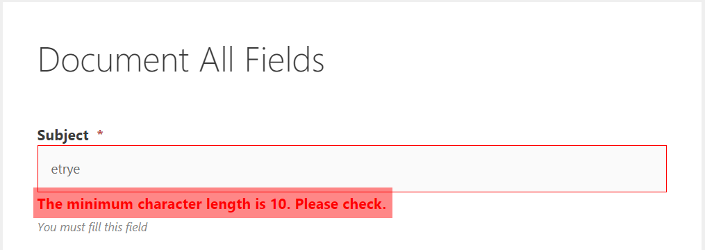
Validation min length
You can establish a minimum for the characters that can be entered in the field. It is useful in case that you want to personalize the field in order to a lower quantity of characters is not entered instead of the established.

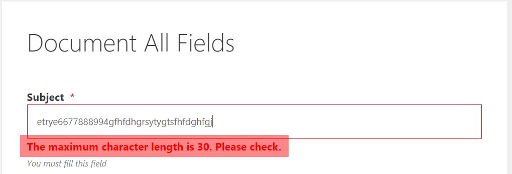
Validation max length
In this case, with this: You can establish a maximum to the characters that can be entered in the field.

Min Length Message and Max Length Message
This option will help you to define the Min or Max Length Message to output to the user in case of the error.

Hidden for logged in user
This allows you to hide a field to the users that are logged in and It will be only visible for the ones that are not logged in. With this option you can implement contact forms to users with credentials and in the field the information is already shown.

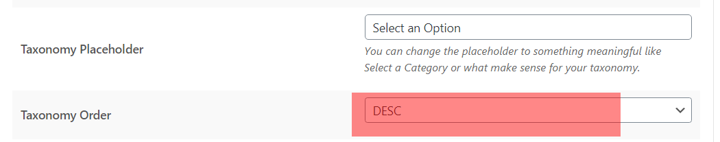
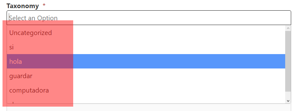
Taxonomy Order
This option is used in the way that you can establish the order in which the options of the field will be shown.
The next images are a representation of the Option in the Form Builder and the Form in the Frontend.
Ascendant Order ASC

Descendant Order DESC

Include Items
You can include one or more elements to the field list. It is useful to include elements in a direct way.

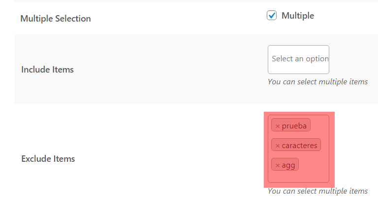
Exclude
You can exclude elements that are going to be charged in the list. It is useful in the case that you want to delete an option from a list such as a category that you do not want to be included.
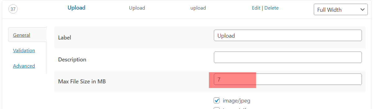
Max file size in M
You can establish the max weight one image can be uploaded
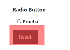
 Reset
Reset
Enables the reset button in the field (fronted), allowing the possibility to reestablish the selected options.